A comprehensive guide to creating inclusive digital experiences that work for everyone, regardless of ability.
Building Accessible Products That Everyone Can Use
Accessibility isn't a feature—it's a foundation. When you build accessible products, you're not just checking compliance boxes. You're creating experiences that work for everyone, that make everyone feel seen, that create true belonging. It's like building a ramp instead of stairs. Sure, stairs work for most people, but ramps work for everyone. Plus, you can skateboard down ramps. Try that with stairs. I dare you.
Why Accessibility Matters
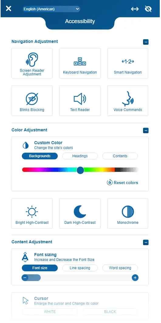
One billion people worldwide have a disability. That's 15% of the global population. That's like excluding everyone in New York, Los Angeles, and Chicago combined. But here's what most product teams miss: accessibility benefits everyone. Closed captions help people in noisy environments (like that one coffee shop with the blender that never stops). High contrast modes help people in bright sunlight (or when you're trying to check your phone at the beach). Keyboard navigation helps power users work faster (and look cooler doing it).
When you build for accessibility, you build for everyone. It's like making a universal remote that actually works. Revolutionary.
Beyond Compliance: The Business Case
Accessibility isn't just the right thing to do—it's smart business. Accessible products reach more users. They rank higher in search results. They reduce legal risk. They improve SEO. They create better user experiences for everyone.
But the real competitive advantage comes from understanding that accessibility isn't a constraint—it's innovation. When you design for people with disabilities, you discover solutions that benefit everyone.
The Four Pillars of Accessibility
Perceivable – Information must be presentable to users in ways they can perceive. This means text alternatives for images, captions for videos, and sufficient color contrast.
Operable – Interface components must be operable. This means keyboard navigation, no time limits that can't be extended, and no content that causes seizures.
Understandable – Information and UI operation must be understandable. This means clear language, consistent navigation, and helpful error messages.
Robust – Content must be robust enough to be interpreted by assistive technologies. This means valid HTML, proper ARIA labels, and semantic markup.
Building Accessibility Into Your Process
Accessibility isn't something you add at the end—it's something you build from the start. Here's how:
Start with research – Understand your users' needs. Talk to people with disabilities. Use assistive technologies yourself. Experience your product the way your users do.
Design with accessibility in mind – Choose colors with sufficient contrast. Design keyboard-friendly interactions. Create clear information hierarchies. Build flexible layouts that work at any size.
Develop with standards – Use semantic HTML. Implement ARIA labels correctly. Test with screen readers. Validate your markup. Follow WCAG guidelines.
Test with real users – Automated tools catch about 30% of accessibility issues. Real users catch the rest. Test with people who use assistive technologies. Learn from their experiences.
Understanding Color Vision Deficiencies
8% of men and 0.5% of women have some form of color vision deficiency. Understanding these conditions helps you design better experiences:
Protanopia – Red-green color blindness where red appears darker. Reds look brown or black. It's like seeing the world through a sepia filter, but permanent.
Deuteranopia – Red-green color blindness where green appears darker. Greens look brown or gray. Traffic lights become a guessing game. "Is that red or... brown? I'll just wait for the other cars to move."
Tritanopia – Blue-yellow color blindness. Blues appear green, yellows appear pink. The sky is green, bananas are pink. It's like living in an alternate universe where color physics work differently.
Achromatopsia – Complete color blindness. Everything appears in shades of gray. It's like watching old movies, but for life. Dramatic? Yes. Practical? Not always.
Your color system must work for all of these users. This doesn't mean avoiding color—it means not relying on color alone. Add icons. Add labels. Add patterns. Make it work for everyone, not just people who see colors the way you do.
The Accessibility Spectrum
Accessibility isn't binary. It's a spectrum. Some users have complete color vision. Others have color vision deficiencies. Some have low vision. Others have high contrast preferences. Your product must work across this entire spectrum.
Common Accessibility Mistakes (And How to Avoid Them)
Relying on color alone – Don't use color as the only way to convey information. Add icons, labels, or patterns. A red error icon and a green success icon look identical to someone with protanopia. Add a checkmark or X, and suddenly everyone understands.
Poor contrast ratios – Text must meet WCAG AA standards (4.5:1 for normal text, 3:1 for large text). Use tools like WebAIM Contrast Checker. Higher contrast improves readability for everyone, not just users with visual impairments.
Missing alt text – Every image needs descriptive alt text. If an image is decorative, use an empty alt attribute.
Keyboard traps – Users must be able to navigate your entire interface with a keyboard. Test tab order. Ensure focus indicators are visible.
Inaccessible forms – Label every input. Group related fields. Provide clear error messages. Make required fields obvious.
Colorblind-unfriendly combinations – Some color combinations work better for colorblind users. Blue and orange work well. So do blue and yellow. Red and green? Not so much. It's like trying to tell apart two identical twins. Technically possible, but unnecessarily difficult.
The Tools You Need
Automated testing – Tools like axe DevTools, WAVE, and Lighthouse catch many accessibility issues automatically. They're like spell check, but for accessibility. And just like spell check, they'll catch things you didn't even know were problems.
Screen readers – Test with NVDA (Windows), VoiceOver (Mac/iOS), or JAWS. Experience your product the way your users do. It's like closing your eyes and navigating your app. Except you can't cheat and peek. And it's actually useful.
Keyboard navigation – Unplug your mouse. Navigate your entire interface with just a keyboard. You'll discover issues you never knew existed. Like that button that's impossible to reach. Or that form that traps you forever. Good times.
Color contrast checkers – Use WebAIM Contrast Checker or Contrast Ratio to ensure your colors meet WCAG standards. Because guessing if your text is readable is like guessing if your coffee is hot. You'll find out eventually, but it might hurt.
Colorblind simulators – Use tools like Color Oracle or Chrome DevTools to simulate color vision deficiencies. See your design through colorblind eyes. It's like trying on someone else's glasses. Everything looks different, and you realize your design might need work.
Building an Accessible Culture
Accessibility isn't just a technical requirement—it's a cultural shift. It requires empathy, curiosity, and commitment. It means asking "Can everyone use this?" at every step of the process.
Start small. Fix one issue at a time. Celebrate progress. Learn from mistakes. Build accessibility into your team's DNA.
The Future is Inclusive
The future of digital products belongs to teams that build with accessibility in mind. Not as an afterthought. Not as a compliance requirement. But as a core principle.
When you build accessible products, you're not just checking boxes. You're creating experiences that work for everyone. You're building products that make everyone feel seen. You're creating true belonging.
The question isn't whether you should build accessible products. The question is: How can you build them better?
Start today. Build with intention. Create experiences that everyone can use. The future depends on it.
