How to architect color systems in React that scale across components, themes, and applications.
React Color Design System: Building Scalable Palettes
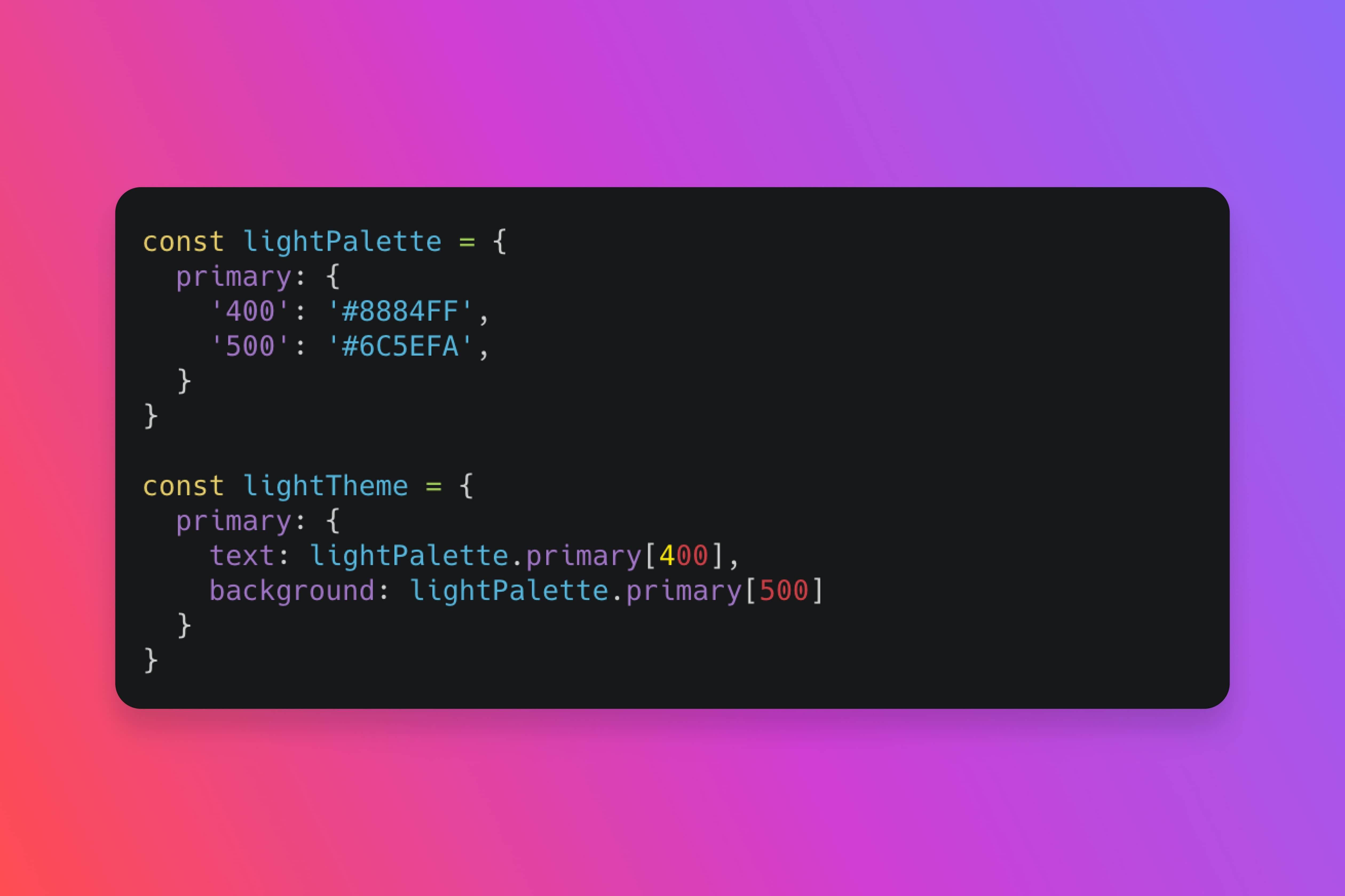
Building a color system in React isn't just about picking colors—it's about creating a scalable architecture that grows with your product. When done right, your color system becomes the foundation for consistency, accessibility, and maintainability.
The Foundation: Color Tokens
Here's a story I've seen play out too many times: A designer picks a beautiful blue for primary actions. A developer hardcodes `#3b82f6` into a button component. Six months later, the brand refreshes, and that blue becomes purple. Now the developer searches through hundreds of files, replacing `#3b82f6` with `#7c3aed`, hoping they don't miss any. They always miss some. And that one button stays blue forever, haunting them like a digital ghost.
Color tokens solve this problem. They're not just hex codes—they're semantic names that describe purpose, not appearance. Instead of `primaryBlue`, use `color.action.primary`. Instead of `darkGray`, use `color.text.secondary`. It's like naming your pets by their personality instead of their color. "This is Fluffy" tells you nothing. "This is DestroysShoes" tells you everything.
Why this matters: When your brand changes, you update one file. Your entire application adapts. It's the difference between rebuilding a house and flipping a switch. One takes months and costs thousands. The other takes seconds and costs nothing. Your choice.
This semantic approach means your colors adapt to themes, contexts, and user preferences without breaking your components. Your dark mode isn't a separate codebase—it's the same tokens, different values.
Structuring Your Color Palette
Think of your color system like a Russian nesting doll—each layer contains the next, but serves a different purpose. A well-structured color system has four layers:
Base colors – Your raw palette: reds, blues, greens, grays. These are your source of truth. They're the pigments on your palette before you start painting. Why start here? Because every other layer builds on these. Change a base color, and you change everything downstream.
Semantic colors – Purpose-driven tokens: `action.primary`, `status.success`, `text.heading`. These map to your base colors but describe function, not appearance. Why semantic? Because "primary" means "main action" whether it's blue, purple, or green. Your components don't care about the color—they care about the purpose.
Component colors – Component-specific tokens: `button.primary.background`, `card.border`. These inherit from semantic colors but add component context. Why this layer? Because a button's primary color might need a slight variation from a link's primary color. Same purpose, different implementation.
Theme colors – Theme variations: `light`, `dark`, `high-contrast`. These override semantic colors to create different visual experiences. Why themes? Because your users work in different environments. Dark mode isn't a nice-to-have—it's a necessity for many users working late nights or in low-light environments.
Each layer serves a purpose. Skip a layer, and you'll pay for it later when you need to scale.
React Implementation Patterns
CSS Variables with React Context – Use CSS custom properties for runtime theming. Wrap your app in a ThemeProvider that updates CSS variables based on context.
Styled Components Theme – If you're using styled-components, leverage their theme prop. Create a theme object with your color tokens and pass it through ThemeProvider.
Tailwind CSS Custom Colors – Define your color system in Tailwind's config. Use semantic names in your `tailwind.config.js` and Tailwind generates utility classes automatically.
Design Tokens Library – Use libraries like `@design-tokens/core` or `style-dictionary` to manage tokens and generate code for multiple platforms.
The Component Architecture
Your color system should work at three levels:
Global tokens – Defined in your theme/design tokens file. These are your source of truth.
Component tokens – Mapped in your component files. Components reference semantic tokens, not base colors.
Runtime overrides – Allow theme switching, user preferences, and context-specific overrides.
Accessibility by Default
I once watched a user struggle with a form. The error message appeared in red text on a red background. The user couldn't see it. They thought the form was broken. It wasn't broken—it was inaccessible. It was like trying to find a red car in a parking lot full of red cars. Technically possible, but why would you do that to yourself?
A scalable color system is accessible by default. This isn't optional. It's foundational. Here's what that means:
Contrast ratios – Every color combination meets WCAG AA standards (4.5:1 for text, 3:1 for UI components). Why this matters: Because 8% of men and 0.5% of women have color vision deficiencies. Low contrast isn't just hard to read—it's impossible to read for some users.
Colorblind-friendly – Don't rely on color alone. Use icons, patterns, or labels to convey meaning. The story: A red error icon and a green success icon look identical to someone with protanopia. Add a checkmark or X, and suddenly everyone understands.
High contrast mode – Support system preferences for high contrast. Your color system should adapt automatically. Why this helps: Users with low vision need higher contrast. Respect their system preferences, and your app becomes usable instead of frustrating.
Focus indicators – Ensure focus states are visible regardless of color scheme. Use outline styles that work with any background. The reality: Keyboard users navigate your entire interface with Tab. If they can't see where they are, they're lost. A visible focus indicator isn't decoration—it's navigation.
Accessibility isn't a feature you add. It's a foundation you build.
Building with TypeScript
TypeScript transforms your color system from a collection of strings into a type-safe architecture. Here's the story: imagine you're building a component library, and a designer asks you to change the primary button color. Without TypeScript, you might typo `#7c3aed` as `#7c3ae` and break your entire design system. With TypeScript, your editor catches the error before you even save.
But TypeScript does more than prevent typos—it teaches your IDE to understand your color system. When you type `colors.action.`, your editor suggests `primary` and `secondary`. It's like having a design system expert sitting next to you, whispering suggestions as you code.
Here's how to build a type-safe color system that scales:
// Step 1: Define your color tokens as a const object// The 'as const' assertion tells TypeScript: "These values are literal types, not just strings"// Why this matters: Without 'as const', TypeScript sees '#7c3aed' as a string.// With 'as const', TypeScript sees it as the literal type '#7c3aed'—making it impossible to assign wrong valuesconst colors = {// ... (click to expand)Click to expand 52 more lines
Why this approach works:
Type safety – TypeScript catches color typos at compile time, not runtime. You'll never ship a broken color to production.
Autocomplete – Your IDE suggests valid color paths as you type. It's like autocomplete for your design system.
Refactoring confidence – When you rename a color, TypeScript shows you every place that needs updating. No more searching through codebases.
Documentation – The types serve as living documentation. New developers can see all available colors just by typing `colors.`.
Single source of truth – Your colors live in one place, but TypeScript ensures consistency everywhere they're used.
This isn't just code—it's a safety net. It's the difference between a color system that breaks silently and one that fails loudly, at development time, when you can still fix it.
Testing Your Color System
Test your color system at multiple levels:
Unit tests – Verify contrast ratios meet WCAG standards. Test that all color combinations are accessible.
Visual regression – Use tools like Chromatic or Percy to catch visual changes when you update colors.
Component tests – Ensure components render correctly with different themes. Test dark mode, high contrast, and custom themes.
User testing – Test with real users, especially those with visual impairments. Get feedback on readability and usability.
The Scalability Challenge
As your product grows, your color system must scale. Here's how:
Version your tokens – When you need to change a color, create a new token version rather than breaking existing ones.
Documentation – Use Storybook or similar tools to document your color system. Show examples, use cases, and accessibility notes.
Migration paths – When deprecating colors, provide clear migration guides. Use linting rules to catch deprecated token usage.
Design tooling – Sync your design tokens with Figma or other design tools. Use plugins like Figma Tokens to keep design and code in sync.
The React Advantage
React's component model makes color systems powerful. You can:
Compose colors – Create higher-order components that apply color themes. Wrap components with color providers.
Dynamic theming – Switch themes at runtime. React's reactivity makes theme changes instant.
Context-based colors – Use React Context to provide color tokens to any component in your tree.
Server-side rendering – Your color system works with Next.js and other SSR frameworks. CSS variables ensure colors render correctly on the server.
Building for the Future
The future of React color systems is:
CSS Color Module Level 4 – New color functions like `color-mix()` and `color-contrast()` will make color systems more powerful.
Container queries – Color systems that adapt to container size, not just viewport size.
User preferences – Systems that respect user preferences for reduced motion, high contrast, and color schemes.
AI-assisted palettes – Tools that generate accessible color palettes based on your brand colors.
Start Building Today
Your color system is the foundation of your design system. Build it right, and everything else becomes easier. Build it wrong, and you'll fight it forever.
Start with semantic tokens. Build accessibility in from the start. Use TypeScript for type safety. Test everything. Document thoroughly.
The best color systems aren't just beautiful—they're scalable, accessible, and maintainable. Build yours with intention. Your future self will thank you.
