Most design systems stop at semantic tokens. 'action.primary'. 'text.heading'. Done.
Intent-Based Design Tokens: Beyond Semantic Naming
But semantic tokens tell you WHERE to use color, not WHY. They answer "What component?" not "What feeling?"
Intent-based tokens go deeper. They organize by emotional goal. What emotion? What action? What story?
Instead of 'action.primary', you have 'trust.calm' or 'energy.action'. Instead of 'status.success', you have 'growth.positive'.
It's the difference between naming a color "blue" and naming it "trust."
Semantic tokens answer "what." Intent tokens answer "why." When you understand why, you make better choices.
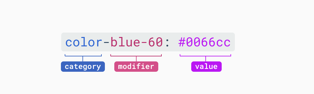
Four layers: base → intent → semantic → component.
Healthcare needs 'trust.calm'. E-commerce needs 'energy.action'. The intent guides the choice.
Your brand changes. Purple becomes blue. With intent tokens, you update one mapping. Components don't break. Only the color changes. The intent remains.
Intent tokens create shared language. Designer: "I need trust." Developer: "Use 'trust.calm'." The conversation shifts from "what color?" to "what feeling?"
Build with intent. Design with meaning.